01 -
Overview
Candy Go Nuts is a family-owned ice cream & candy shop on Cape Cod. It's one of the few ice cream shops that also has a variety of candy for kids to make their own candy bags. The shop needed a logo to be used for stickers as well as eventually on store apparel.
02 -
Design Thinking
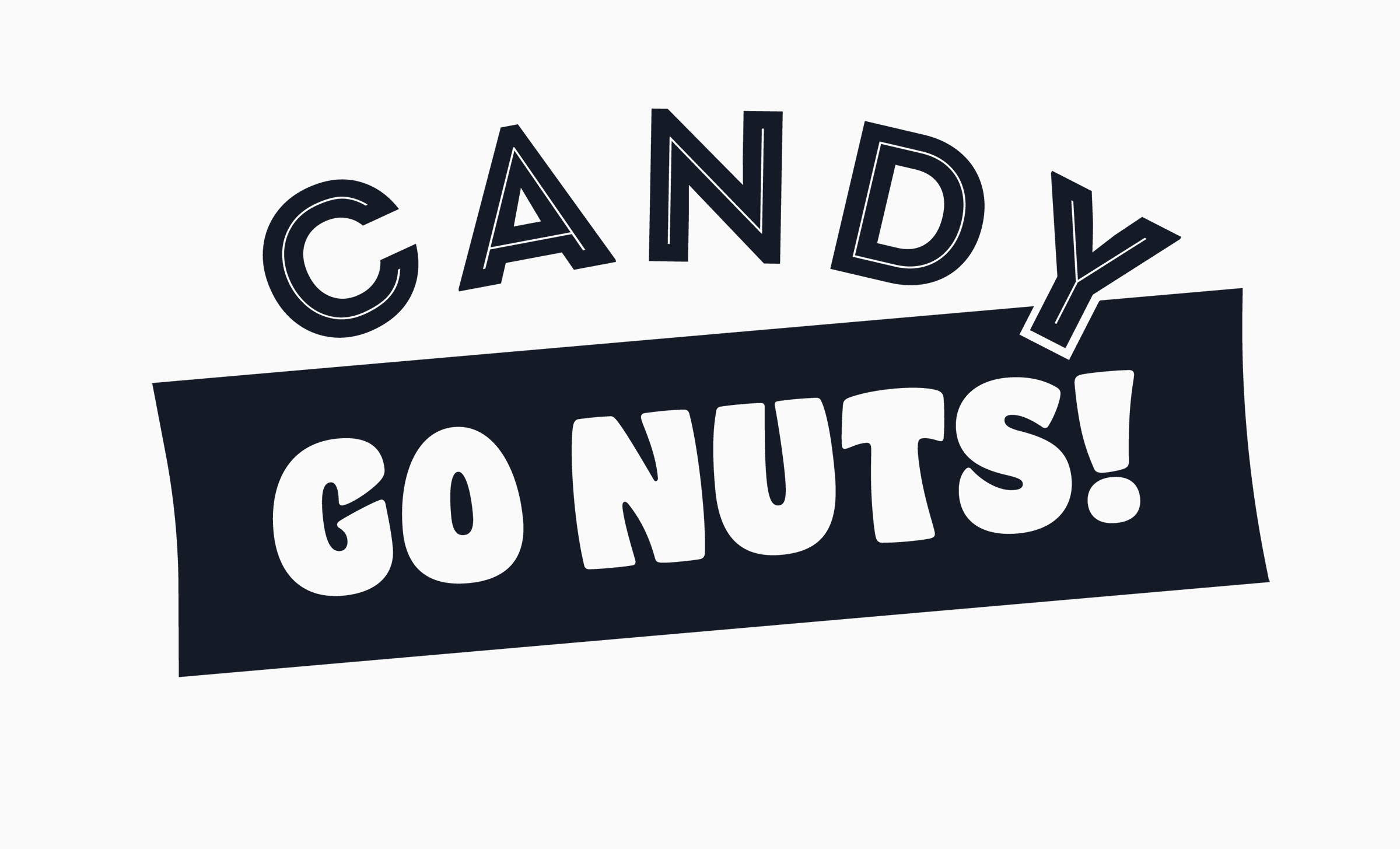
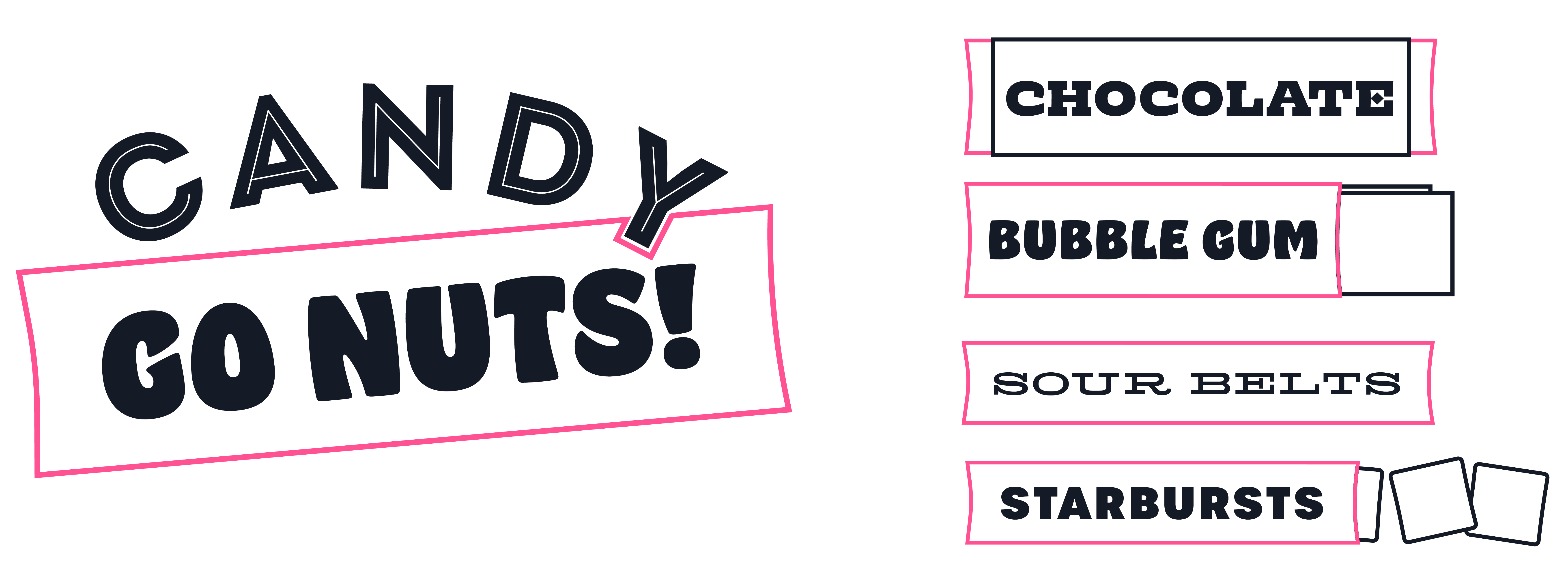
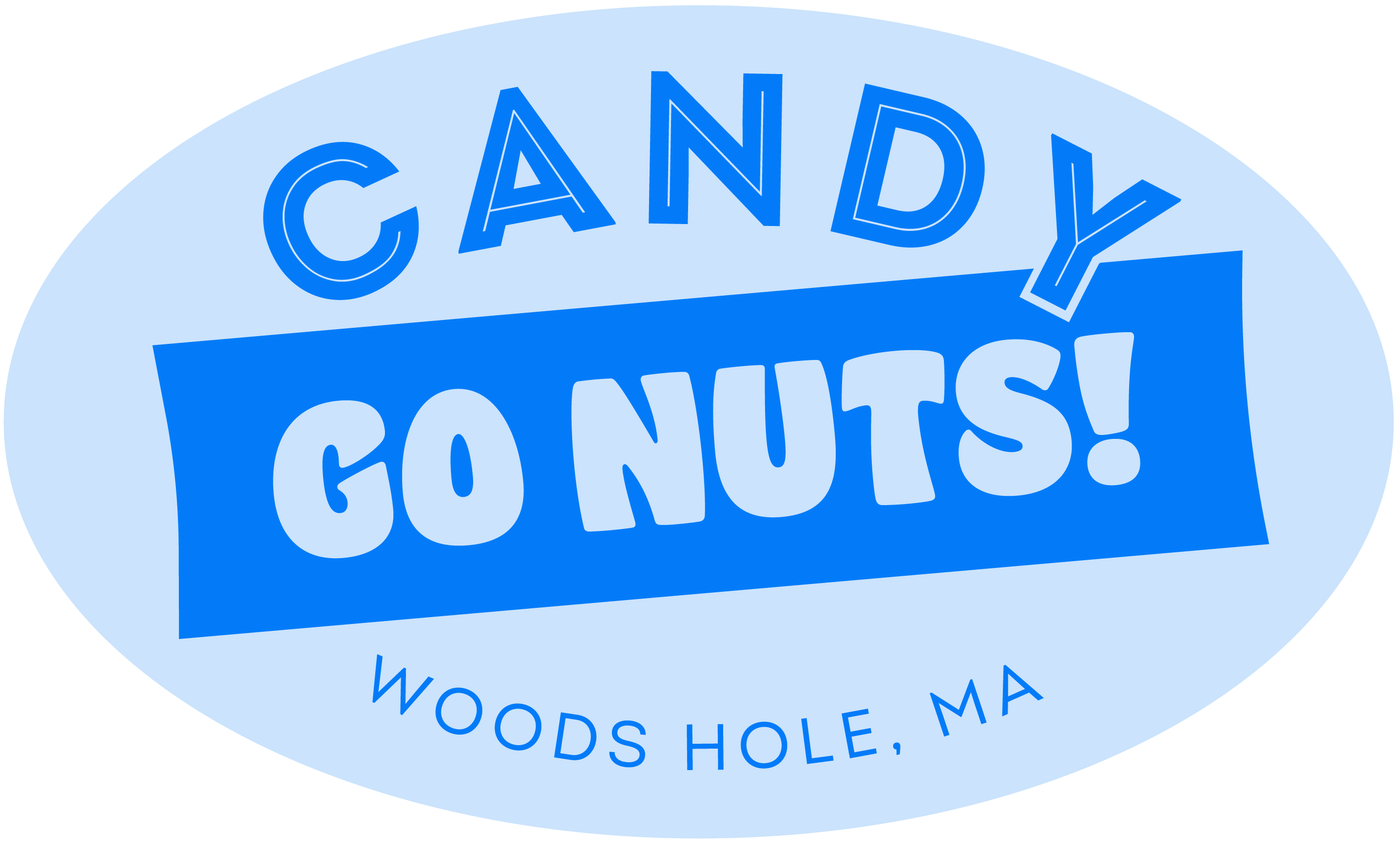
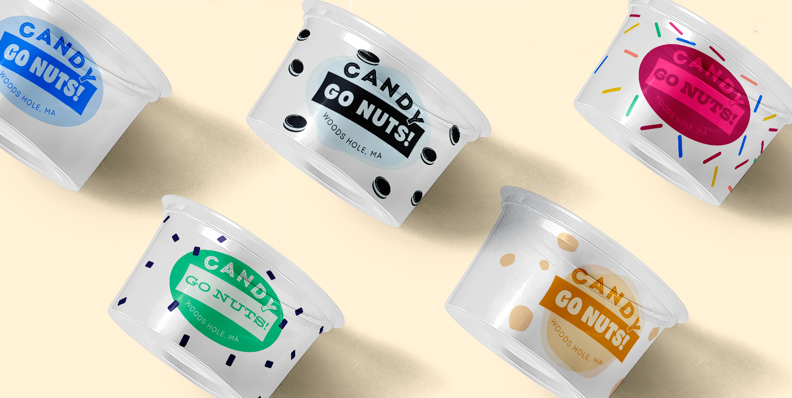
Since Candy Go Nuts sells a wide array of candy and ice cream flavors, the logo should be dynamic and playful. Typography and colors were used as a way to give each version of the logo its own flavor while still tying back to the original brand. With typefaces ranging in weights and styles, each variation has a slightly different personality. For logo anatomy, the placement of "Go Nuts" and the logo's structure is inspired by candy packaging while the color palette was derived from the interior of the shop.
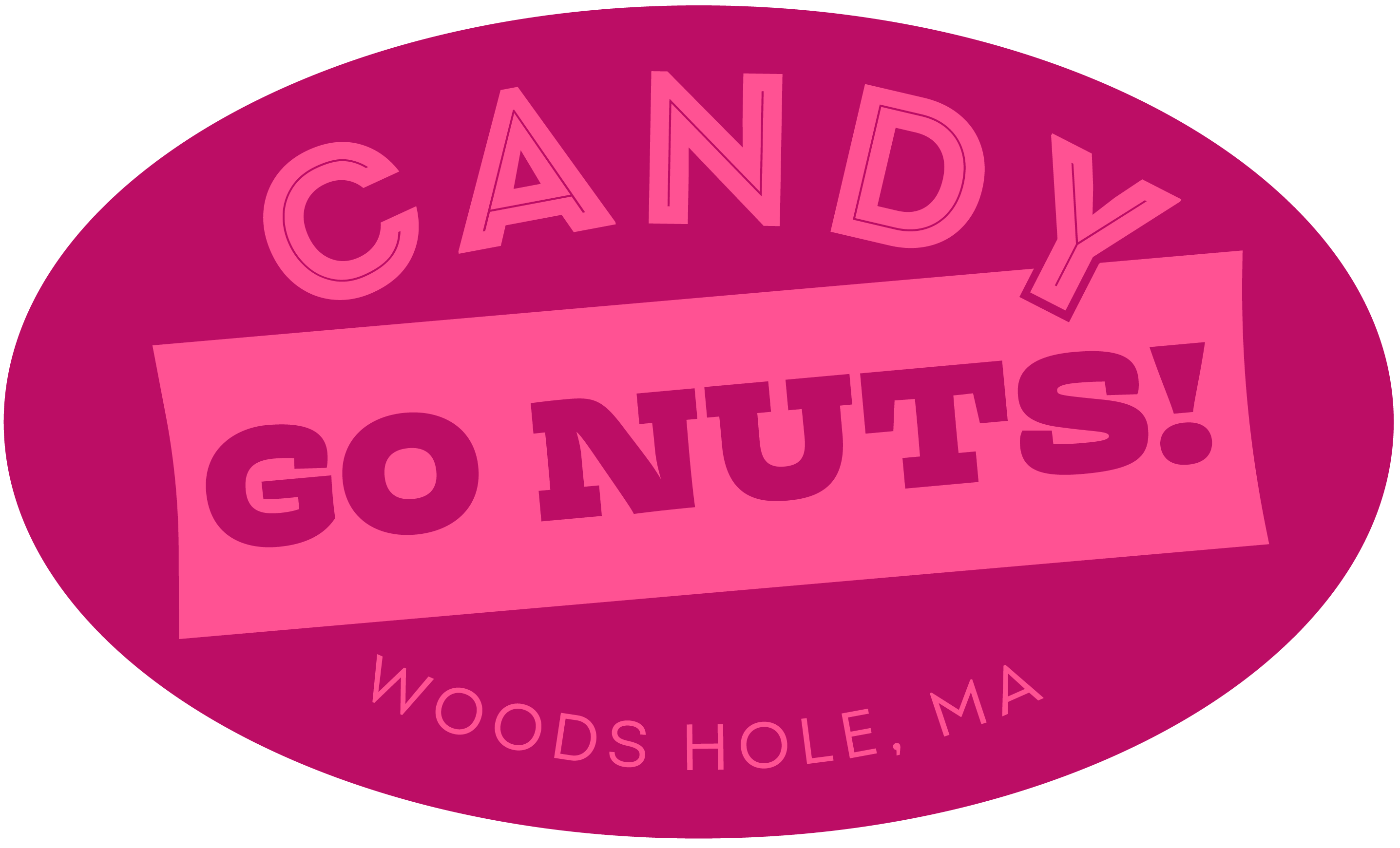
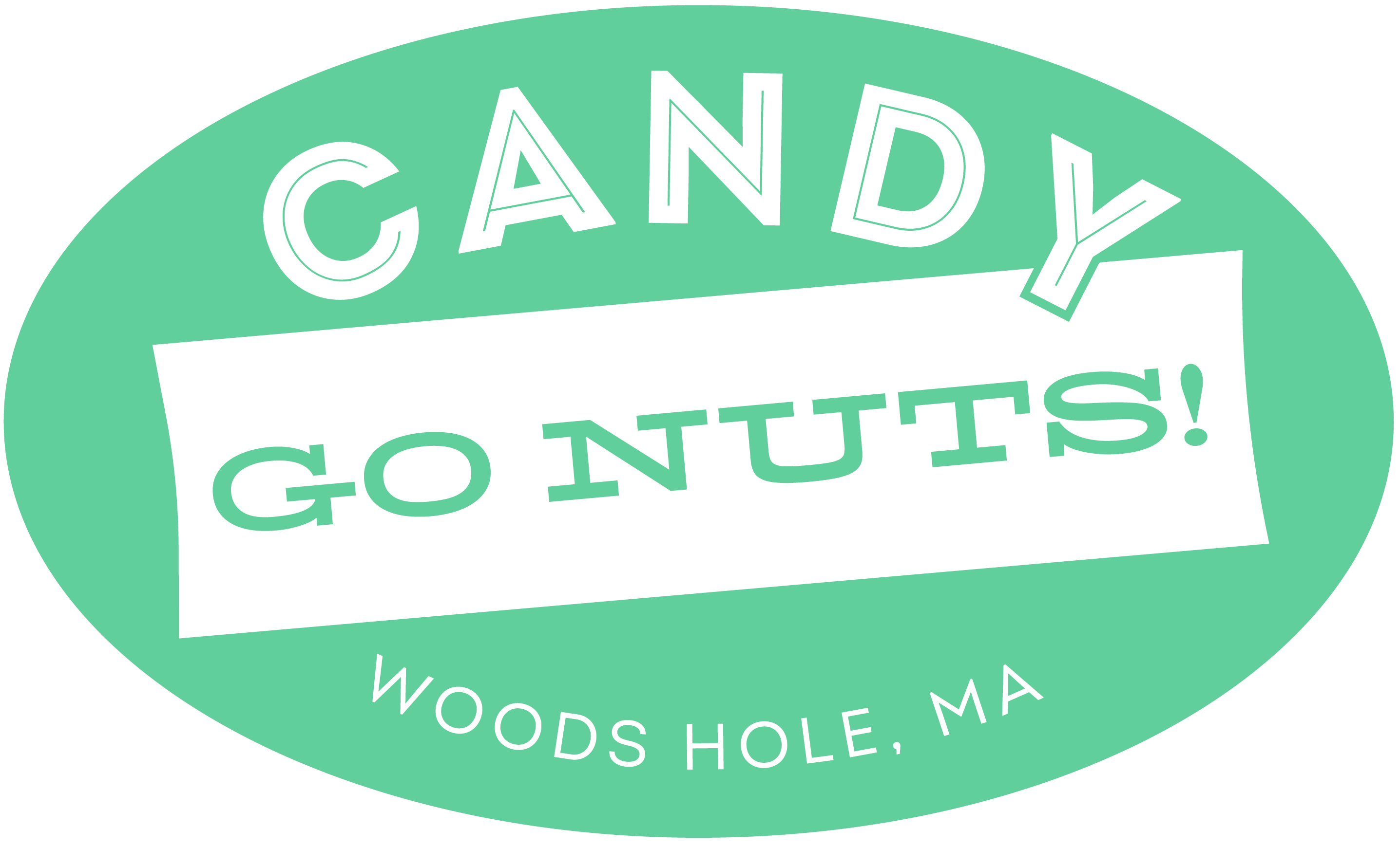
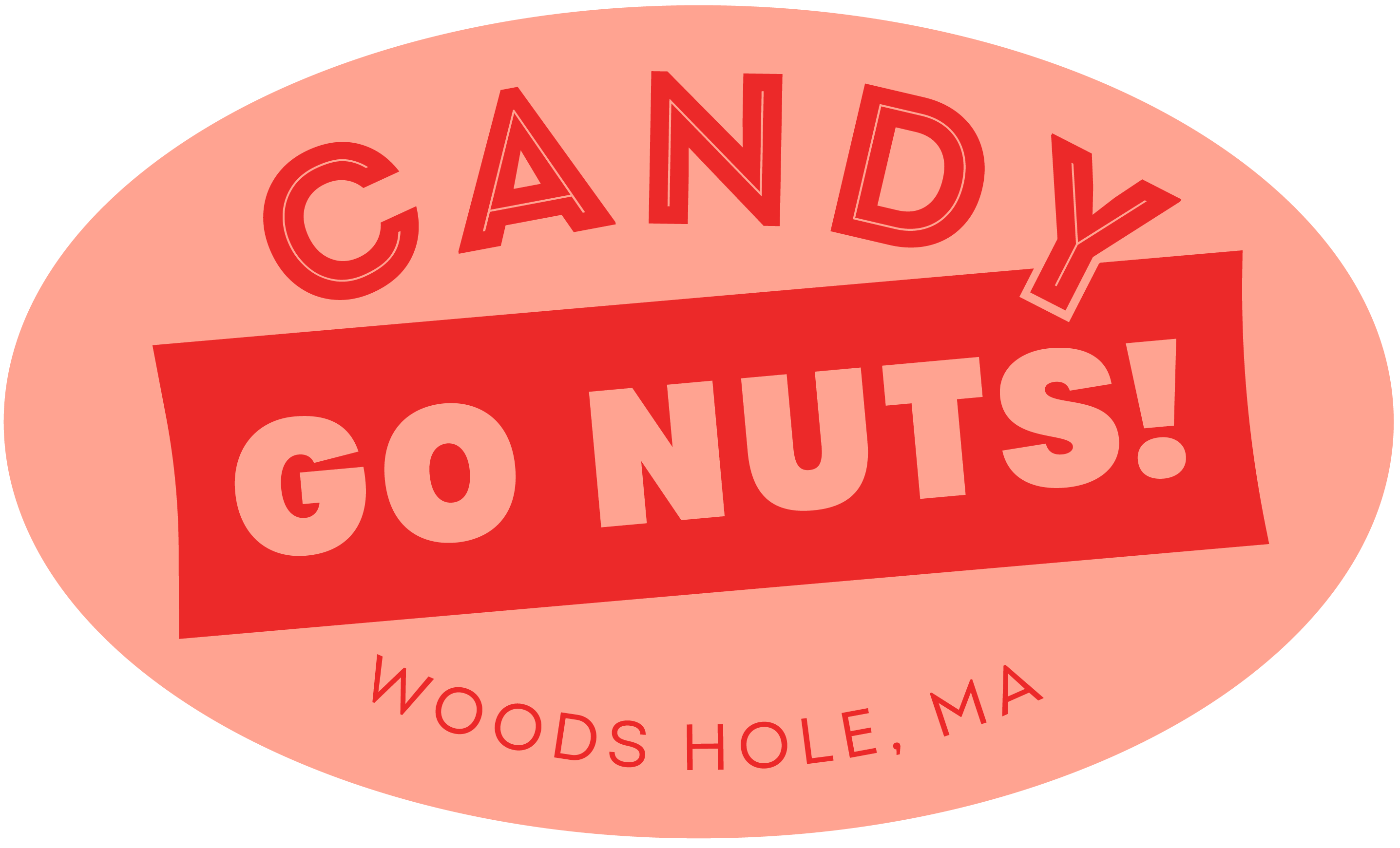
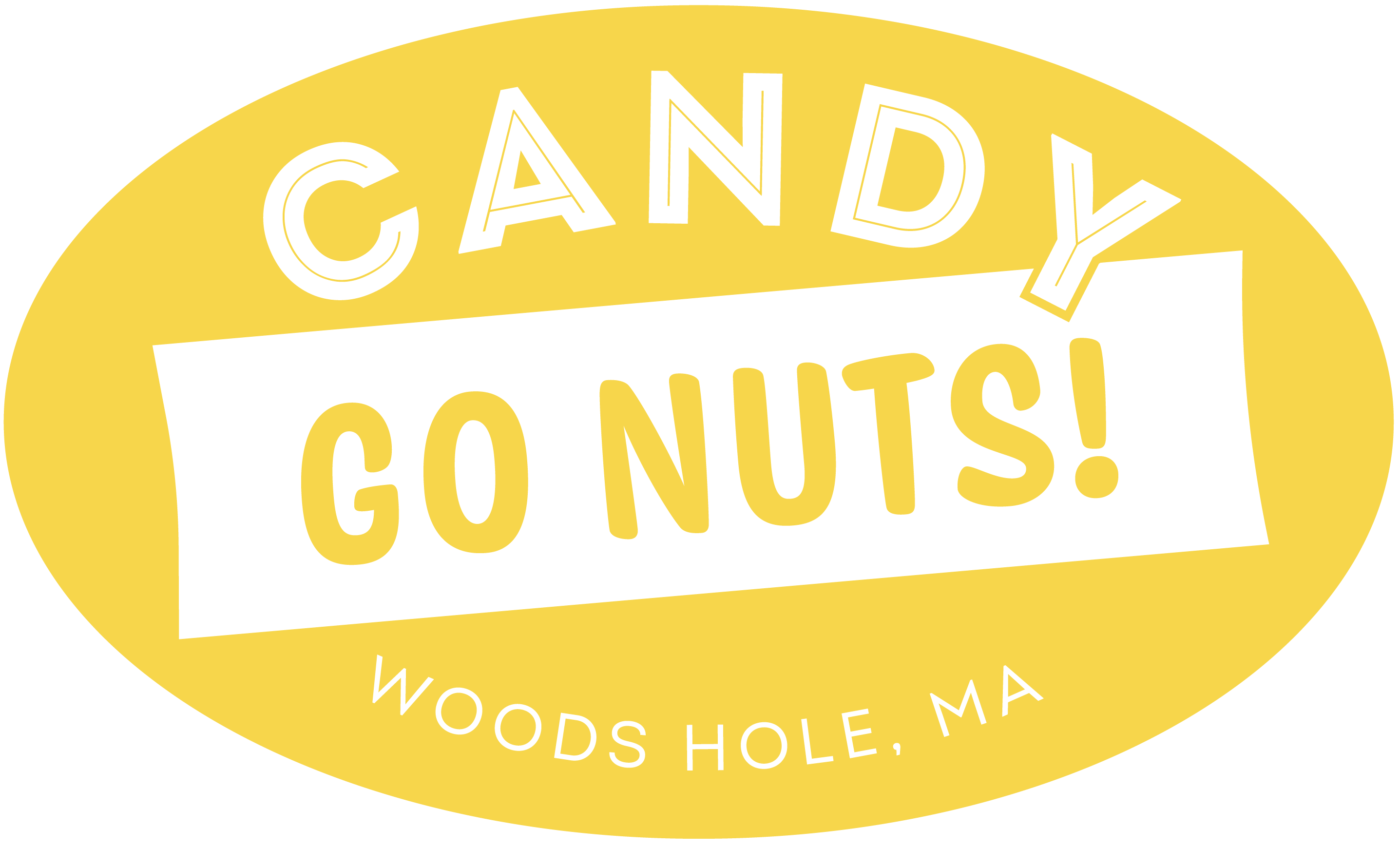
03 -
Color Palette
Candy Go Nuts sells a wide variety of candy and ice cream flavors, which inspired a dynamic and playful logo. For brand identity, typography and colors were used as a way to give each iteration of the logo its own flavor while still tying back to the original brand. With typefaces ranging in weights and styles, each variation has a slightly different personality. The logomark is built of a structure inspired by candy packaging and can appear in a variety of colors derived from the interior of the shop.

Designed by Elisabeth Bowerman