01 -
Overview
Thomas Moakley ran for State Senate in March of 2020 and needed campaign branding. Moakley was born and raised on Cape Cod and has always had a love for boats and the ocean. He wanted a campaign logo that was relevant for the Cape Cod districts he'd be representing but also simple and memorable. The logo created was meant to encapsulate his initials as well as an anchor; a symbol of strength and security. Moakley's logo used an anchor as a nod to his nautical background as well as his father who was a captain for NOAA and passed away in the early stages of Thomas's campaign.
02 -
Logo Anatomy
Moakley's campaign logo uses his initials and negative space to form the shape of an anchor. The typeface Nexa worked nicely for this layout as well as for signage and other branding.

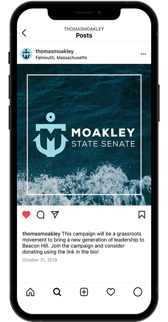
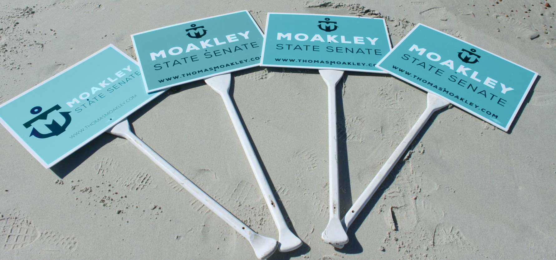
03 -
Usage
The logo was designed to be scalable and dynamic for publicity; ranging from social media to lawn signs, pins, and banners.

Designed by Elisabeth Bowerman